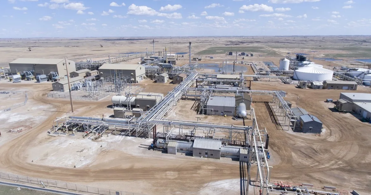







Three screens from a live run: the project board, the experiment analysis, and the insight review.
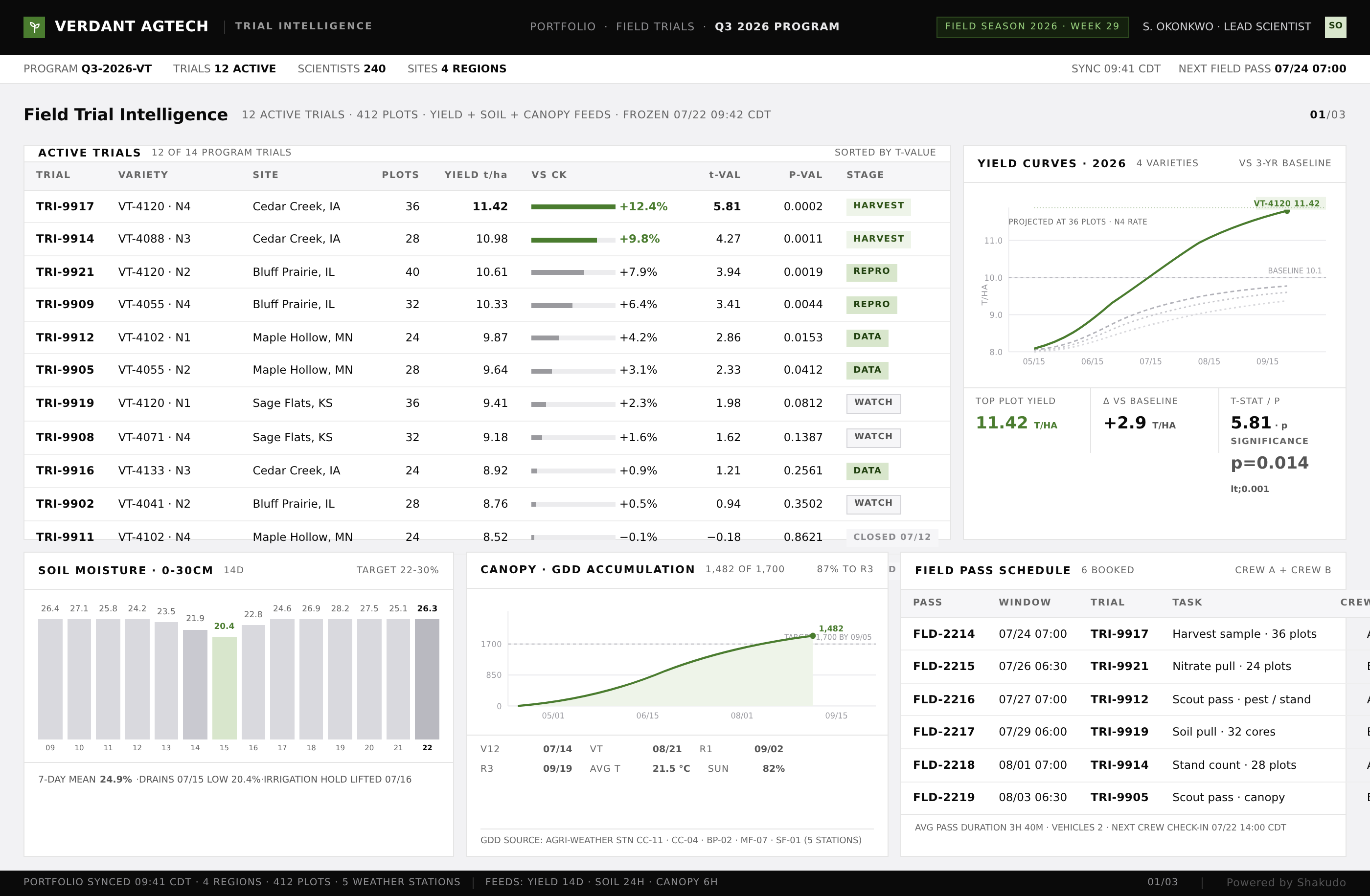
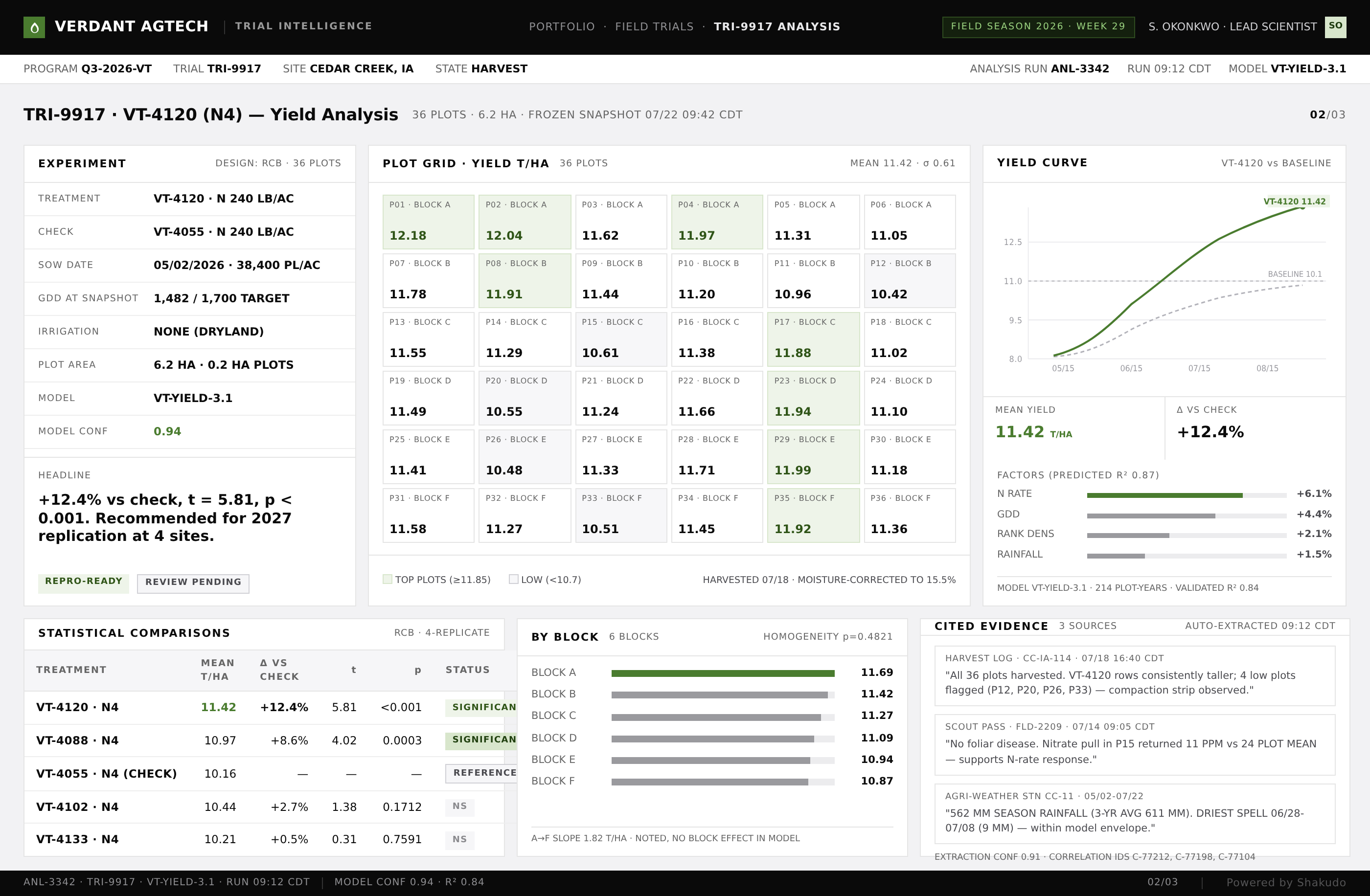
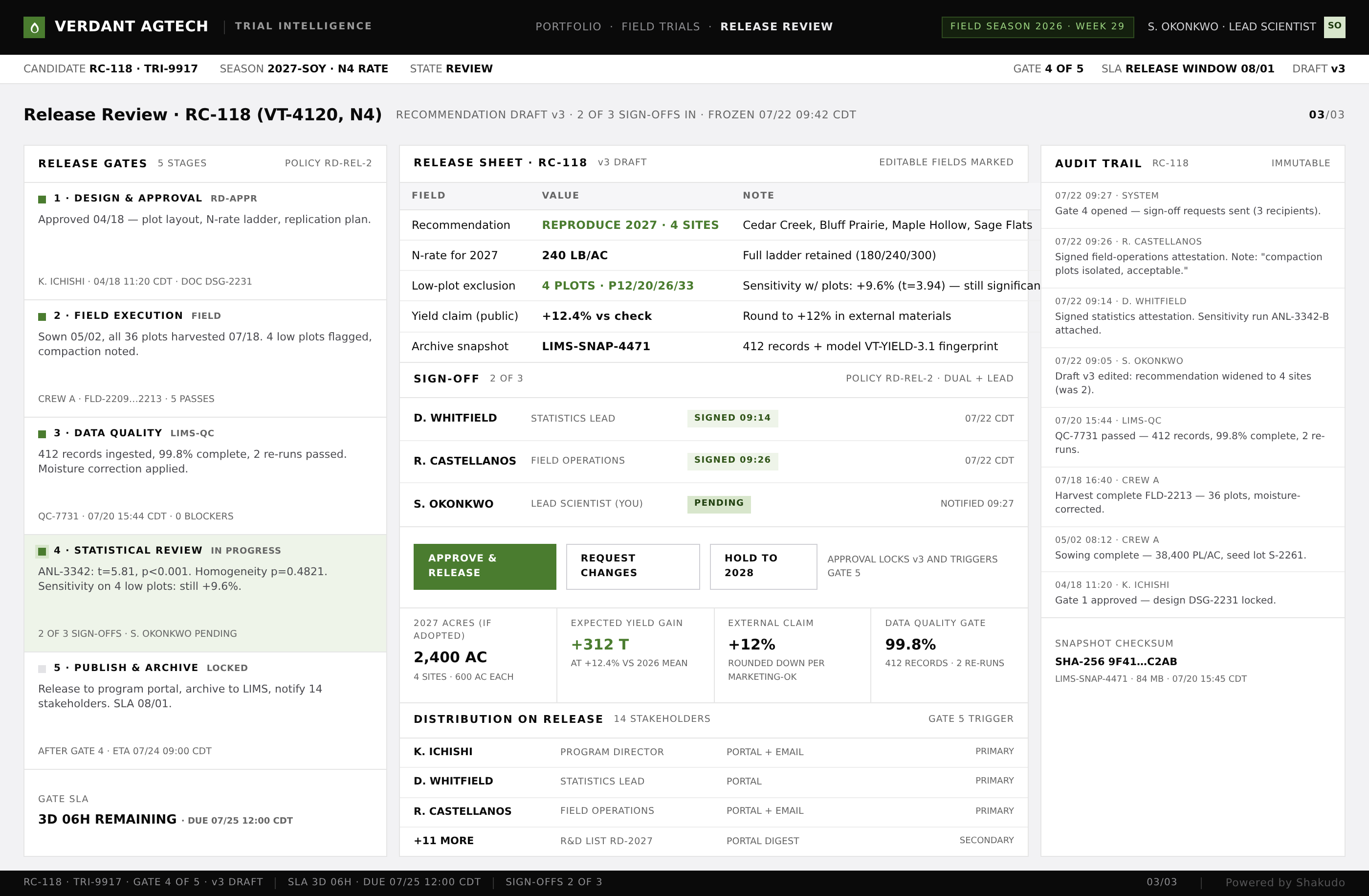
1–2 / 3
Engineers spend up to 30 percent of their time searching for and reconciling data instead of analyzing it. For an energy company running hundreds of R&D projects simultaneously, that lost time shows up as delayed decisions and duplicate experiments. An R&D dashboard brings experiments, simulations, and field tests into a single visual interface that updates in real time, so results are visible without switching between disconnected tools or spreadsheets.
R&D data in energy engineering lives in silos. Test results sit in lab information management systems. Simulation outputs rest on high-performance computing clusters. Project timelines live in separate planning tools. Field sensor data streams into databases that research teams rarely access directly. Each source tells part of the story, but no single view connects them.
This fragmentation has real costs. Research decisions get delayed because teams cannot see the full picture. Duplicate experiments run because one team does not know another already tested the same parameters.
The problem grows with scale. An industrial energy company running 200 concurrent R&D projects generates thousands of data points daily across lab tests, pilot programs, and field deployments. Manual reporting cannot keep pace. By the time a weekly status report reaches decision makers, the data is already outdated.
Shakudo deploys a real-time R&D dashboard inside the customer's existing infrastructure, so proprietary research data never leaves the corporate network. The dashboard connects lab instruments, simulation outputs, sensor feeds, and project management APIs into one visual layer. Engineers filter by project, date range, material type, or test condition without writing queries, and the interactive charts, heat maps, and trend lines update as new information flows in.
An AI layer does the interpretive work. Natural language processing models extract structured information from research notes, lab reports, and technical documents that would otherwise require manual interpretation. Classification models categorize experiment results and tag them with project metadata. Predictive models trained on historical experiment data project likely outcomes for ongoing tests, and anomaly detection highlights unexpected results that might indicate equipment failures or new discoveries worth investigating. The measurable outcomes: hours previously spent compiling status reports and reconciling data return to the team, and the dashboard becomes an active research assistant that surfaces insights engineers might otherwise miss.
The dashboard pipeline works in layers. Ingestion connectors pull from SCADA systems for field data, laboratory information management systems for test results, and simulation tools for computational models. An AI processing layer normalizes formats, enriches records with contextual metadata, and flags anomalies for review. The visualization layer renders the processed data into interactive charts, heat maps, and trend lines that update as new data arrives from connected sources.
A vector database enables semantic search across research documents and experiment notes. Engineers ask questions in plain language and retrieve relevant past experiments, related findings, and associated project data instead of digging through file systems. AI components process queries and generate automated reports. An incremental deployment approach works well: start with one data source, prove value, then expand to additional systems as teams adopt the dashboard.
Python powers the data pipelines that handle ingestion and normalization from every connected source. LangChain orchestrates the AI components that process queries and generate summaries, and OpenAI models handle natural language understanding for search and automated reporting. Qdrant stores the vector representations of research documents and experiment notes, which makes plain-language semantic search possible. FastAPI serves the processed data to the front end, and Streamlit builds the interactive dashboard engineers use day to day.
The stack runs on premises, inside the corporate network, so research data stays in a controlled environment while access controls ensure each team sees only the projects and data relevant to it.
The dashboard fits research engineers, lab teams, simulation groups, and project leads in energy and climate organizations that run large parallel R&D programs, from materials testing to grid optimization studies. It suits operations teams that track hundreds of concurrent projects, need every experiment result and project metric in one real-time view, and cannot send proprietary research, patented technologies, or regulated operational data outside the corporate network.
An R&D dashboard connects to laboratory information management systems, SCADA systems, simulation outputs, sensor feeds, project management tools, and document repositories. Python-based ingestion pipelines handle the data normalization, and API connectors adapt to each source format. The system aggregates all connected sources into unified visual views that update in real time as new data arrives.
AI processes raw research data into structured, searchable formats. Natural language models extract key information from lab notes and technical documents, classification models tag experiment results automatically, and predictive models project likely outcomes based on historical data. Engineers search across all R&D data using plain language and receive visual summaries without manual report compilation.
Yes. The entire dashboard stack runs within your existing infrastructure. Data stays inside the corporate network, and access controls restrict visibility by team and project. This approach suits energy companies that handle proprietary research, patented technologies, and regulated operational data that cannot leave controlled environments.
A basic dashboard connecting one or two data sources can be operational in weeks when built on an existing AI platform. Full integration across all research systems takes longer but follows an incremental path. Each connected data source delivers value independently, so teams see benefits early and the dashboard expands organically as adoption grows.
When the goal is a real-time R&D dashboard over research data, a conversation with Shakudo is the fastest way to see it on your own data. The pipeline deploys on your own infrastructure, on-premises or in your cloud, and a first working pipeline is in place within days. Book a demo to watch it run on a connected source.
R&D dashboard data visualization aggregates research data, experiment results, and project metrics into a single interactive interface that updates in real time. Engineering teams can track progress across multiple projects, correlate findings from different sources, and identify trends without manually compiling reports. The system pulls data from lab instruments, simulation tools, and project management platforms into unified visual views.










"What drew me in is simple. When developers ship production-ready code this quickly, how can I have environments spun up fast enough? Shakudo is how we close that gap."


"Shakudo does not just provide the platform. It is a real partnership. They are always there to help and execute our vision faster and the right way. It is like a co-team working together to achieve our goals."